Week(1)Mike
Market Mogul » Devlog


27/09/2023
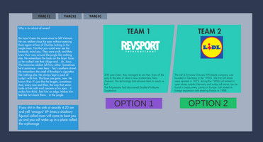
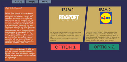
This prototype was to test what color schemes were appealing to people and what made them uncomfortable and so on. All of the colors were based from real websites or color pallets that are in use. That info is useful to us so later we can expect to set up players to feel a certain way when they encounter a window that they should be cautions on or not trust. different layouts were planned but ended up not in this version due to not bearing useful info. Results showed that darker and warmer colors seemed more friendly and people chose second variant of the page more than others
Get Market Mogul
Market Mogul
Buisness managment game with a retro aesthetic
| Status | Released |
| Authors | Popcane, Funnymike |
| Genre | Strategy |
| Tags | 2D, Arcade, Atmospheric, Casual, Comedy, Pixel Art, Point & Click, Retro, Singleplayer, Unity |
More posts
- Week (15) DevlogJan 12, 2024
- Week (11) DevlogDec 06, 2023
- Week(10) AlphaNov 29, 2023
- Week(9) DevlogNov 22, 2023
- Week (5) DevlogOct 25, 2023
- Week 3 Update (Daragh)Oct 25, 2023
- Week (4) DevlogOct 19, 2023
- Week(3) MikeOct 12, 2023
- Week 2 Update (Daragh)Oct 04, 2023

Leave a comment
Log in with itch.io to leave a comment.